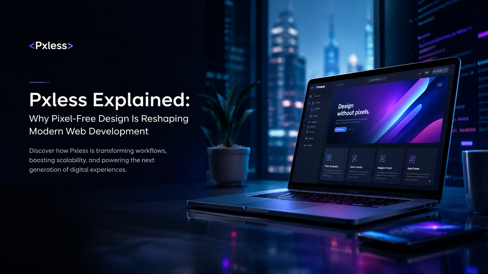
Introduction
The term pxless has started appearing across design communities, web development discussions, UX forums, and emerging digital publications. At first glance, it looks like another technology buzzword. Many people assume it’s a new framework, a design tool, or a startup platform.
The reality is more interesting.
Pxless represents a broader shift in how digital experiences are designed and built. Instead of relying heavily on fixed pixel values, pxless thinking encourages designers and developers to create interfaces that adapt naturally to screens, users, accessibility settings, and future devices.
That shift matters because the internet no longer lives on a single monitor size.
A website may be viewed on a compact Android phone in the morning, a tablet during travel, a desktop workstation in the office, and a 4K television in the evening. Fixed dimensions that once seemed precise can quickly become limitations.
This is why many modern design systems increasingly favor fluid layouts, scalable typography, responsive spacing, and relative units over strict pixel-based measurements. Pxless is often used as the umbrella concept describing this evolution.
For developers, it means building more resilient interfaces.
For businesses, it means better usability, stronger accessibility compliance, and improved user engagement.
For users, it simply means websites feel more natural.
Understanding pxless is no longer just a niche topic for UI designers. It sits at the intersection of responsive design, accessibility, performance optimization, SEO, and user experience strategy. As screen diversity continues to expand, the principles behind pxless are becoming increasingly relevant across the entire digital ecosystem.
What Does Pxless Actually Mean?
The word breaks down into two parts:
- px = pixel
- less = reduced dependency
Pxless does not mean pixels disappear completely.
Screens still render content using pixels. Developers still occasionally use pixel values where appropriate.
Instead, pxless means reducing dependence on fixed pixel measurements as the primary method for controlling layouts and interfaces.
Traditional web design often looks like this:
font-size: 16px;
padding: 40px;
width: 1200px;
A pxless approach might use:
font-size: 1rem;
padding: 2rem;
max-width: 70rem;
width: 100%;
The difference seems small.
The impact is enormous.
The first example assumes users view content under predictable conditions.
The second allows the interface to adapt dynamically based on screen size, zoom level, accessibility preferences, and viewport dimensions.
That flexibility sits at the core of pxless philosophy.
Why Pixel-Based Design Is Becoming Less Effective
For years, pixel-perfect design was considered the gold standard.
Design teams spent countless hours ensuring every button, image, and margin aligned perfectly according to fixed dimensions.
That made sense when users primarily browsed on desktop monitors.
Today’s environment is radically different.
Users interact with:
- Smartphones
- Tablets
- Foldable devices
- Gaming handhelds
- Smart TVs
- Laptops
- Ultra-wide monitors
- Wearables
Each device introduces unique display characteristics. Fixed layouts often struggle to adapt.
Common Problems With Pixel-Heavy Design
| Issue | Result |
|---|---|
| Fixed typography | Poor readability |
| Static layouts | Broken mobile experiences |
| Excessive breakpoints | Complex maintenance |
| Rigid spacing | Visual inconsistency |
| Limited scaling | Accessibility problems |
| Device-specific designs | Higher development costs |
As screen diversity expands, pixel-perfect increasingly becomes device-specific rather than universally usable.
Pxless attempts to solve this problem by focusing on behavior instead of fixed dimensions.
The Core Principles Behind Pxless Design
1. Fluid Layouts
Rather than defining exact widths, pxless systems allow content containers to grow and shrink naturally.
Examples include:
- Percentage-based widths
- CSS Grid
- Flexbox
- Container queries
- Fluid spacing systems
The goal is adaptability.
A layout should respond to available space rather than forcing content into predetermined dimensions.
2. Relative Units Instead of Fixed Pixels
Pxless designs frequently use:
| Unit | Purpose |
|---|---|
| rem | Typography and spacing |
| em | Relative sizing |
| % | Flexible containers |
| vw | Viewport width |
| vh | Viewport height |
| clamp() | Fluid scaling |
These units adjust automatically according to context.
That means fewer manual adjustments across devices.
3. Content-First Thinking
Traditional design often begins with screen dimensions.
Pxless reverses the process.
The primary question becomes:
“How should the content behave?”
Instead of:
“How many pixels wide should this section be?”
This subtle mindset change often leads to stronger usability and cleaner interfaces.
4. Accessibility as a Foundation
Accessibility is not treated as an afterthought.
Users frequently modify:
- Browser zoom
- Font sizes
- System display settings
- Screen magnification tools
Pixel-based designs often break under these conditions.
Pxless layouts tend to adapt more gracefully because scalability is built into the design itself.
How Pxless Improves SEO
Many people view pxless as purely a design topic.
In reality, it has direct SEO implications.
Better Mobile Experience
Google prioritizes mobile usability.
Responsive, adaptable interfaces generally perform better than rigid layouts that struggle across devices.
Improved User Engagement
When users can comfortably read content regardless of device size:
- Bounce rates may decrease
- Session duration often increases
- Pages become easier to navigate
These behavioral signals contribute to stronger overall website performance.
Faster Development and Maintenance
Pxless systems often require:
- Fewer layout overrides
- Cleaner CSS architecture
- Reduced design duplication
Simpler systems can contribute to improved performance and scalability.
Pxless vs Traditional Pixel-Based Design
| Feature | Traditional Design | Pxless Design |
|---|---|---|
| Layout Structure | Fixed | Fluid |
| Typography | Pixel-based | Scalable |
| Accessibility | Limited | Strong |
| Device Adaptation | Breakpoint-dependent | Naturally responsive |
| Maintenance | Higher | Lower |
| User Flexibility | Restricted | Enhanced |
| Future Compatibility | Moderate | High |
This comparison explains why pxless discussions continue growing among modern front-end teams.
Real-World Example: Building a Blog Layout
Imagine a news website.
Traditional Method
width: 1200px;
font-size: 16px;
padding: 30px;
The layout looks excellent on one screen size.
Problems appear when users:
- Zoom to 200%
- Open the site on a foldable device
- View content on an ultra-wide display
Pxless Method
max-width: 70rem;
font-size: clamp(1rem, 2vw, 1.3rem);
padding: 2rem;
Now typography scales smoothly.
Containers adapt naturally.
Content remains readable across multiple environments.
The design becomes more resilient rather than more rigid.
Technologies That Support Pxless Design
Several modern technologies align naturally with pxless principles.
CSS Grid
Enables flexible layouts without fixed positioning.
Useful for:
- Dashboards
- News websites
- Product grids
- Content-heavy applications
Flexbox
Allows components to adapt according to available space.
Excellent for:
- Navigation systems
- Card layouts
- Form structures
- Responsive content blocks
Container Queries
One of the most significant modern CSS developments.
Instead of responding only to screen size, elements respond to the size of their parent container.
This creates highly adaptive components.
Fluid Typography
Using:
clamp()allows text to scale smoothly between minimum and maximum values.
Many pxless systems rely heavily on this technique.
Common Misconceptions About Pxless
Myth 1: Pixels Are Dead
False.
Pixels remain useful.
Pxless simply reduces excessive dependence on them.
Myth 2: Pxless Means No Design Control
False.
Designers still control visual hierarchy, spacing, and layout systems.
The difference is that designs become adaptive rather than rigid.
Myth 3: Responsive Design and Pxless Are Identical
Not exactly.
Responsive design focuses on adapting layouts.
Pxless extends that idea by encouraging flexible behavior from the beginning rather than relying heavily on breakpoint adjustments.
Myth 4: Pxless Is a Framework
Another common misunderstanding.
Pxless is primarily a philosophy or methodology.
It is not a single tool, library, or platform.
Common Mistakes Beginners Make
Using Pixels Everywhere
Many developers continue applying fixed values to:
- Typography
- Margins
- Containers
- Buttons
This creates scaling issues later.
Ignoring Accessibility Testing
A layout may appear perfect under default settings yet fail when users zoom or increase text size.
Overusing Media Queries
Large collections of breakpoints often indicate an overly rigid design system.
Pxless encourages more natural scaling.
Designing Around Devices Instead of Content
Modern interfaces should prioritize content behavior over device categories.
A page should work well whether viewed at 412px or 1847px wide.
How Businesses Benefit From Pxless Design
The business case is stronger than many realize.
Reduced Maintenance Costs
Adaptive systems require fewer redesign cycles as new devices emerge.
Better User Satisfaction
Users spend less time fighting layouts.
They focus on content.
Stronger Accessibility Compliance
Many accessibility standards align naturally with scalable design systems.
Future-Proof Development
Technology changes constantly.
Rigid layouts age quickly.
Flexible systems remain usable for much longer.
Practical Pxless Implementation Checklist
Design
Start with content
Use scalable typography
Build fluid grids
Test extreme screen sizes
Design for zoom and accessibility
Development
Use rem instead of fixed font sizes
Use percentages where appropriate
Implement CSS Grid and Flexbox
Use clamp() for fluid scaling
Minimize unnecessary breakpoints
Performance
Reduce CSS complexity
Avoid duplicated layouts
Test responsive behavior frequently
Prioritize readability over precision
The Future of Pxless
The rise of:
- Foldable devices
- Smart displays
- Mixed-reality interfaces
- AI-generated layouts
- Adaptive design systems
makes fixed-dimension thinking increasingly difficult to justify.
Future digital experiences will likely become even more context-aware.
Interfaces may adapt not only to screen size but also:
- Viewing distance
- User preferences
- Device capabilities
- Environmental conditions
Pxless aligns naturally with that future because it prioritizes flexibility over fixed measurements.
Expert Perspective: Why Pxless Is Really About User Experience
The most important insight often gets overlooked.
Pxless is not fundamentally about CSS units.
It is about users.
When designers obsess over exact pixels, they optimize for screenshots.
When they embrace pxless thinking, they optimize for experiences.
That distinction changes how products are built.
A truly successful interface is not one that looks perfect on a designer’s monitor.
It is one that remains useful, readable, accessible, and intuitive regardless of where it appears.
That philosophy is ultimately why pxless continues gaining attention among designers, developers, UX strategists, and digital businesses alike.
Frequently Asked Questions
What is pxless?
Pxless is a design philosophy that reduces dependence on fixed pixel values and instead emphasizes fluid, scalable, and responsive design systems.
Is pxless a software tool?
Usually no. Most references use pxless to describe a design approach rather than a specific software product.
Does pxless eliminate pixels completely?
No. Pixels still exist and remain useful in some situations. Pxless simply reduces overreliance on fixed pixel measurements.
Which CSS units are commonly used in pxless design?
Common units include:
- rem
- em
- %
- vw
- vh
- clamp()
These help create more adaptive interfaces.
Is pxless good for SEO?
Indirectly, yes. Better responsiveness, accessibility, and user experience can contribute to stronger search performance.
Does pxless replace responsive design?
No. Pxless complements responsive design and often enhances it by making layouts more fluid and scalable.
Is pxless suitable for WordPress websites?
Yes. WordPress themes and modern page builders increasingly support responsive units and fluid design systems that align with pxless principles.
Why is pxless becoming more popular?
Growing device diversity, accessibility requirements, and demand for flexible user experiences have accelerated interest in pxless methodologies.
Can beginners adopt pxless design?
Absolutely. Starting with relative units like rem and percentage-based layouts is often the easiest first step.
Is pxless the future of web design?
While pixels will never disappear entirely, the broader movement toward adaptive, scalable, user-centered design strongly aligns with pxless principles and is likely to continue expanding.
About the Author


2 thoughts on “Pxless Explained: Why Pixel-Free Design Is Reshaping Modern Web Development”